
Welcome to another Top 5 Wednesday as hosted by Lainey of gingerreadslainey. Today’s topic is our top five more disappointing eye candy reads. What does that mean? Well, you know when a book has an incredibly beautiful or eye catching cover, but the content of the book disappoints you? Yeah, this is that list.
So here are my top five disappointing eye candy reads:
5. Me and Earl and the Dying Girl by Jesse Andrews

I really like this cover and how it represents each of the three important characters in this book. I love the colors and how it looks like cutouts and just the overall aesthetic of it. But the content inside of it really let me down. It had gotten a decent amount of hype last year and so when I read it I was left confused, annoyed, and just disappointed. Check out my review for more thoughts.
4. P.S. I Still Love You by Jenny Han
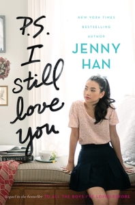
I love the covers of this duology a lot. They’re beautifully photographed and the typography is lovely. And for this book in particular it’s not that I didn’t enjoy the story overall – it’s that the love triangle felt like a plot device and I just couldn’t jump on it. If that forced triangle hadn’t been there then maybe I would have liked it much more than I did, but yeah, that was the disappointing part of this book. Check out my review for more thoughts.
3. Allegiant by Veronica Roth

Okay, honestly, these book covers are awesome. Featuring skylines of the city and their world, plus really cool looking symbols, I love these covers. But the content of this third book just brought all of that admiration to a halt. Not only was it near impossible to differentiate between Four’s and Tris’s voices in this book, but also the ending – though valid – was depressing as hell. And the plot of this particular book made no sense at all and didn’t really flow with the first two. So disappointing. Check out my review for more thoughts.
2. Red Queen by Victoria Aveyard
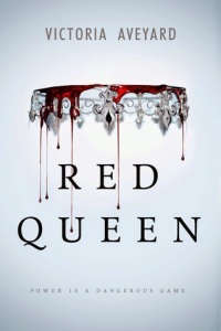
While this cover is simplistic in design, I love the minimalist feeling of it. The red dripping down symbolizes the importance of blood in the book, but the content of the book was just short of what I was expecting. This book was hyped through the roof last year, and many, MANY people were let down by its contents. I’m going to continue with the trilogy, though, and give it another shot, but upon my first read through, I didn’t enjoy it. Check out my review for more thoughts.
1 . The Winner’s Curse by Marie Rutkoski

A recent read, this book trilogy has beautiful covers depicting Kestrel, the main female character, in her society clothes. Each cover is beautiful and really shows the overall mood of the story. But this first book was such a huge let down for me because I wanted to love it so much. I found it to be boring and lifeless, the only time the characters came alive was when they kissed or were near each other. So, so sad because I really hoped to love it. Check out my review for more thoughts.
So there you have it, my top five most disappointing eye candy.
Let me know what books you loved the covers of but thought that the story could have used more.

Oh no I have all these books on my tbr for this year.
LikeLike
Give them a try! Just because I didn’t like them doesn’t mean that you won’t. c:
LikeLiked by 1 person
I had Me and Earl and the Dying Girl in my top too. That book was a complete disappointment because a lot of people love it. I should have remembered about P.S. I Still Love You and Allegiant. I had problems with both.
LikeLike
It makes me sad when there’s buzz and then it’s a let down.
LikeLiked by 1 person
Me, Earl & the Dying Girl should’ve been on my list. I really didn’t like that book. Very disappointing since it got so much hype.
LikeLike
I agree. Definitely wished for more.
LikeLike
Yeah, I agree completely with Red Queen – it just wasn’t very good, and I found it rather… predictable? PS I Still Love You was also a bit of a let down since I liked the first book.
LikeLike
I really enjoyed the first book in the TATBILB duology and had high expectations. It’s not that I didn’t like the second book, it just was… yeah, predictable.
LikeLike
Pingback: January 2016 Wrap-Up | Reader Rayna